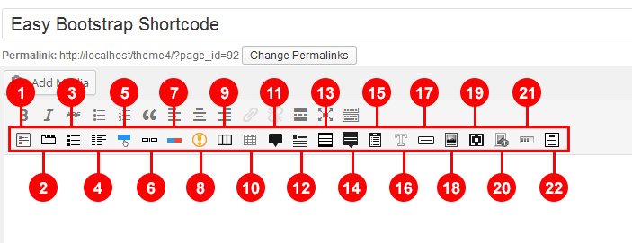
1. Easy Bootstrap Shortcode(EBS) Plugin Introduction
Easy Bootstrap Shortcode is bootstrap 3.0 compatible wordpress plugin which add icons to wordpress editor (tinyMCE Shortcode Buttons) and one can add bootstrap style to their website just by clicking on tinyMCE editor icon.
EBS provide almost all bootstrap features in very simple manner. It enables you to create responsive and attractive content for your website.
When you click on tinyMCE Shortcode Buttons a shortcode for that feature is added to your tinyMCE editor content section, in front end you get your desired customized feature.
First time in wordpress history EBS enables you to write nested EBS shorcodes.
2. Easy Bootstrap Shortcode (EBS) Plugin Installation Instructions.
You will get easy-bootstrap-shortcode.zip file within your purchased zip file.
You can install EBS By following methods.
- Please navigate to "Plugins -> Add New" in your wordpress site's admin panel.
- Click on Upload
- Select select "easy-bootstrap-shortcode.zip" file included in your purchased file.
- Click Install Now
- After the Plugin is successfully installed, click Activate
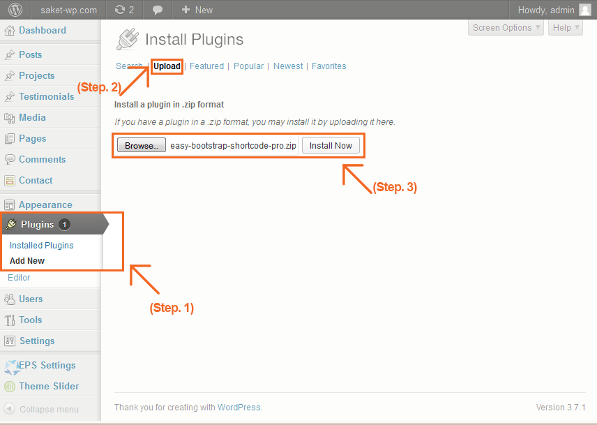
Or use alternate method.
- Extract "easy-bootstrap-shortcode.zip" file, and put the extracted folder into "wordpress -> wp-content -> plugins" directory.
- Please navigate to "Plugins" in site's admin panel
- Activate the Easy Bootstrap Shortcode plugin.
3. Easy Bootstrap Shortcode(EBS) Shortcodes
EBS adds 32 incredible shortcode icons to your wordpress tinyMCE editor icon toolbar. By clicking these icons you can add shortcode to editor. A option to add custom class is provided with every shortcode to enhance flexibility of design.
Here is explained list of EBS Shortcodes :
1. Accordion (Collapsible Menus)
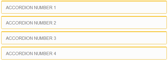
Accordion or Toggles are collapsible menus by which you can show more content in lesser space. To add Accordion(Toggle) to your Page/Post click on Toggle Shortcode icon. Shortcode will be added to your editor, replace the custom class, toggle titles and content with desired one.
[toggles class="yourcustomclass"]
    [toggle title="Accordion number 1"] ... [/toggle]
    [toggle title="Accordion number 2"] ... [/toggle]
    [toggle title="Accordion number 3"] ... [/toggle]
    [toggle title="Accordion number 4"] ... [/toggle]
[/toggles]
[toggles] Parameters are:
| Parameter |
Description |
Required |
Values |
Default |
| class |
Add custom class to toggle div in front end |
optional |
|
yourcustomclass |
[toggle] Parameters are:
| Parameter |
Description |
Required |
Values |
Default |
| title |
Title of toggle link |
Required |
|
Accordion number 1 |
2. Tabs
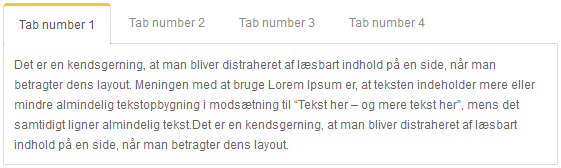
Tabs are bootstrap tabs.To add Tabs to your Page/Post click on Tab Shortcode icon. Shortcode will be added to your editor, replace the custom class, Tab titles and content with desired one.
[tabs class="yourcustomclass"]
    [tab title="Tab number 1" active="active"] ... [/tab]
    [tab title="Tab number 2"] ... [/tab]
    [tab title="Tab number 3"] ... [/tab]
    [tab title="Tab number 4"] ... [/tab]
[/tabs]
[tabs] Parameters are:
| Parameter |
Description |
Required |
Values |
Default |
| class |
Add custom class to tabs div in front end |
optional |
|
yourcustomclass |
[tab] Parameters are:
| Parameter |
Description |
Required |
Values |
Default |
| title |
Title for Tab heading |
Required |
|
Tab number 1 |
| active |
Tells which tab should be active |
Required |
active |
active |
3. List
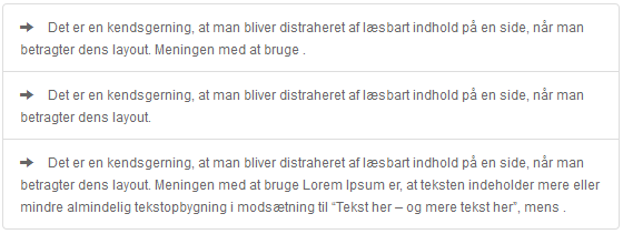
List show responsive list item in front end.To add Lists to your Page/Post click on List Shortcode icon. A dialogue box will appear, select list style, provide value for No. of list item and custom class, click on "Insert List" button. Shortcode will be added to your editor.
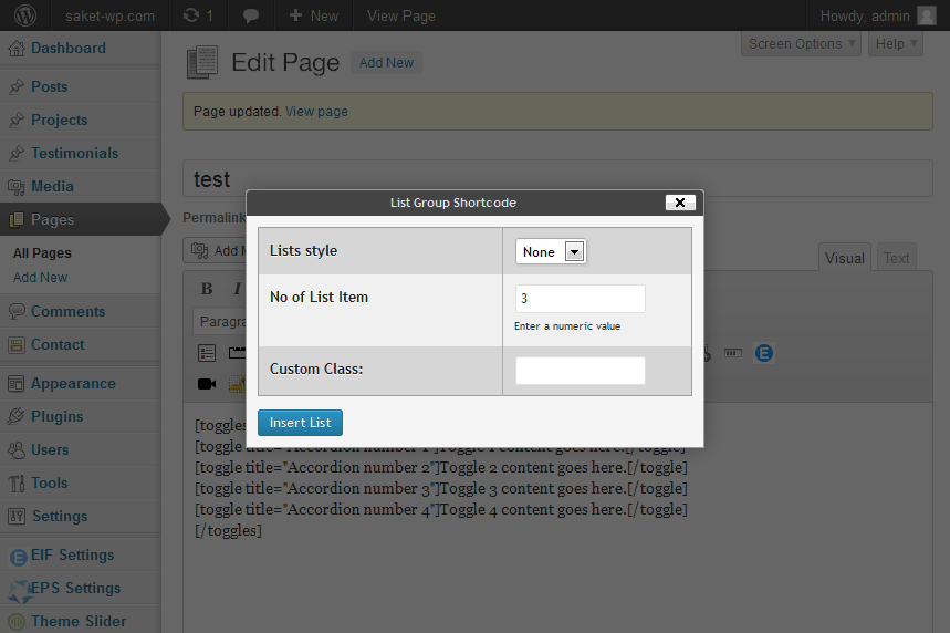
[list class="sfsf"]
    [li type="glyphicon-ok"] ... [/li]
    [li type="glyphicon-ok"] ... [/li]
    [li type="glyphicon-ok"] ... [/li]
[/list]
[list] Parameters are:
| Parameter |
Description |
Required |
Values |
Default |
| class |
Add custom class to list div in front end |
optional |
|
|
[li] Parameters are:
| Parameter |
Description |
Required |
Values |
Default |
| type |
specifty the list style front end |
optional |
glyphicon-arrow-right, glyphicon-ok, glyphiconplus, glyphicon-minus |
|
4. Button
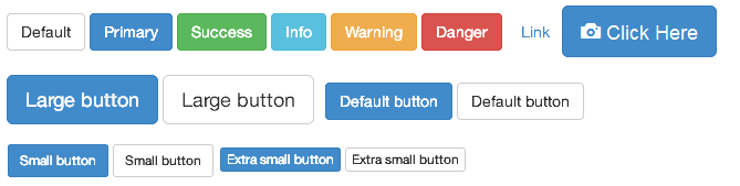
Buttons are responsive bootstrap button, Button type can be either link or button. To add Buttons to your Page/Post click on Button Shortcode icon. A dialogue box will appear, select button style, size, type, button icon, icon alignment and provide value for other fields and custom class, click on "Insert Button" button. Shortcode will be added to your editor.
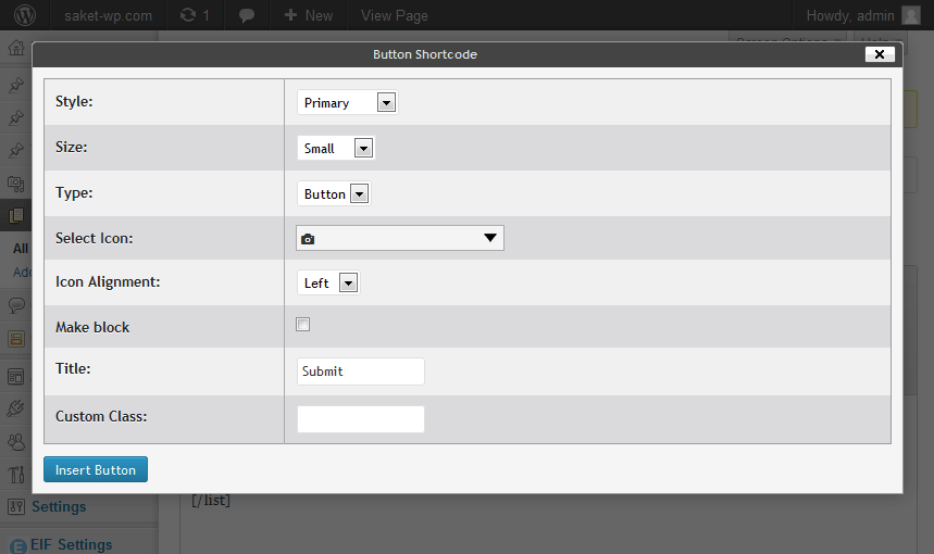
[button style="btn-default btn-lg" icon="glyphicon-align-justify" align="left" type="link" target="false" title="Button" link="#"]
[button] Parameters are:
| Parameter |
Description |
Required |
Values |
Default |
| style |
Specifies button style |
required |
btn-default, btn-primary, btn-primary, btn-success, btn-info, btn-warning, btn-danger, btn-link |
btn-default |
| style |
Specifies button size |
optional |
btn-lg, btn-sm, btn-xs |
btn-lg |
| style |
Make button width 100% |
optional |
btn-block |
|
| icon |
Add icon to button text if you want |
optional |
|
Icon Values |
| align |
specifies icon align to the left or right of button text |
optional |
|
right, left |
| type |
Tells whether button will be link or simple button. |
required |
link |
link, button |
| target |
Tells whether the link will be opened in new tab or not. |
optional |
|
true |
| title |
The button text. |
required |
Button |
|
| link |
The href of button if button type is link. |
optional |
Give the URL of any webpage or just leave it '#' |
|
| class |
Add custom class to list div in front end |
optional |
|
|
5. Notification

Notifications are bootstrap alert boxes. To add Notifications to your Page/Post click on Notification Shortcode icon. A dialogue box will appear, select notification type, check for close link, provide value for custom class, click on "Insert Notification" button. Shortcode will be added to your editor.
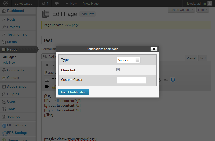
[notification type="alert-warning" close="true" ] ... [/notification]
[notification] Parameters are:
| Parameter |
Description |
Required |
Values |
Default |
| type |
specify the notification type |
required |
alert-warning, alert-success, alert-info, alert-danger |
alert-warning |
| close |
Weather to show close link on notification in front end |
optional |
true |
|
| class |
Add custom class to notification div in front end |
optional |
|
|
6. Column

Columns are used to indent content in specific width each row is made up of 12 columns. To add Columns to your Page/Post click on Column Shortcode icon. A dialogue box will appear, select number of columns for a row, select column width and offset and check to hide column for large, medium, small, extra-small screens, provide value for custom class, click on "Insert Column" button. Shortcode will be added to your editor.
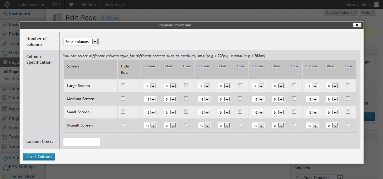
[row class="test"]
    [column lg="6" lgoff="4" smhide="yes" ]
     ...
    [/column]
    [column lg="6" ]
     ...
    [/column]
[/row]
[row] Parameters are:
| Parameter |
Description |
Required |
Values |
Default |
| class |
Add custom class to column div in front end |
optional |
|
|
[column] Parameters are:
| Parameter |
Description |
Required |
Values |
Default |
| lg |
Specifies column width in large screen |
required |
1-12 |
12 |
| md |
Specifies column width in medium screen |
optional |
1-12 |
|
| sm |
Specifies column width in small screen |
optional |
1-12 |
|
| xs |
Specifies column width in extra small screen |
optional |
1-12 |
|
| lgoff |
Specifies column offset in large screen |
optional |
1-11 |
|
| mdoff |
Specifies column offset in medium screen |
optional |
1-11 |
|
| smoff |
Specifies column offset in small screen |
optional |
1-11 |
|
| xsoff |
Specifies column offset in extra small screen |
optional |
1-11 |
|
| lghide |
Specifies whether to hide column in large screen |
optional |
yes |
|
| mdhide |
Specifies whether to hide column in medium screen |
optional |
yes |
|
| smhide |
Specifies whether to hide column in small screen |
optional |
yes |
|
| xshide |
Specifies whether to hide column in extra small screen |
optional |
yes |
|
7. Tables
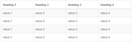
Tables are responsive bootstrap table. To add Table to your Page/Post click on Table Shortcode icon. A dialogue box will appear, provide value for table width, number os rows and columns, custom class, select table style, check options for table hover effect and responsive table. click on "Insert Table" button. Shortcode will be added to your editor.
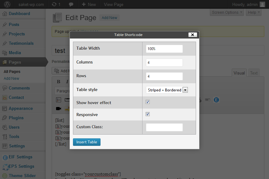
[table width ="100%"  responsive ="false"]
    [table_head]
        [th_column] ... [/th_column]
        [th_column] ... [/th_column]
    [/table_head]
    [table_body]
        [table_row]
            [row_column] ... [/row_column]
            [row_column] ... [/row_column]
        [/table_row]
        [table_row]
            [row_column] ... [/row_column]
            [row_column] ... [/row_column]
        [/table_row]
    [/table_body]
[/table]
[table] Shortcode Parameters are:
| Parameter |
Description |
Required |
Values |
Default |
| width |
Specifies table width |
required |
In % or in px |
100% |
| style |
Specifies table style |
optional |
table-striped, table-striped |
|
| style |
Show hover effect on table |
optional |
table-hover |
|
| responsive |
Specifies wheather to make table responsive or not |
required |
true, false |
false |
| class |
Add custom class to table div in front end |
optional |
|
|
[table_head] Parameters are:
None
[th_column] Parameters are:
None
[table_body] Parameters are:
None
[table_row] Parameters are:
None
[row_column] Parameters are:
None
8. Tooltip

Tooltips can be attached to link or buttons. When you hover the element with your mouse, the title attribute is displayed in a little box next to the element, just like a native tooltip. To add Tooltip to your Page/Post click on Tooltip Shortcode icon. A dialogue box will appear, select tooltip style,type provide value for tooltip text, link, value class. click on "Insert Table" button. Shortcode will be added to your editor.
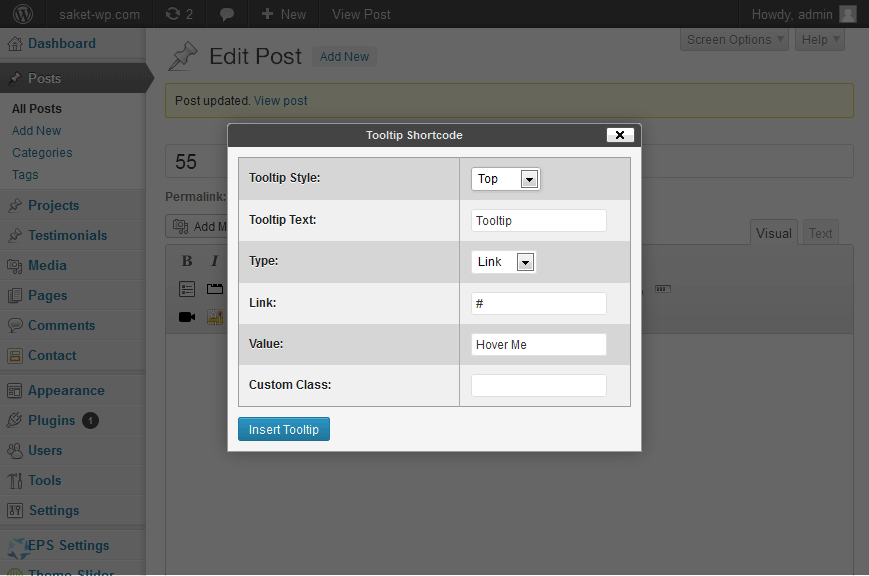
[tooltip type="link" link="#" tooltip="Tooltip" style="top" class="nbgj"]
 ...
[/tooltip]
[tooltip] Shortcode Parameters are:
| Parameter |
Description |
Required |
Values |
Default |
| type |
Element type for which tooltip will be added |
required |
link, button |
link |
| link |
href for link if tooltip type is link |
optional |
Give the URL of any webpage or just leave it '#' |
| tooltip |
tooltip text |
required |
|
Tooltip |
| style |
Tooltip alignment |
required |
top, bottom, left, right, auto |
top |
| class |
Add custom class to tooltip div in front end |
optional |
|
|
9. Icon Heading

Icon Heading used to show heading with glyphicon icon. To add Icon Heading to your Page/Post click on Icon Heading Shortcode icon. A dialogue box will appear, select value for icon, heading type, provide value for heading and custom class. click on "Insert Icon Heading" button. Shortcode will be added to your editor.
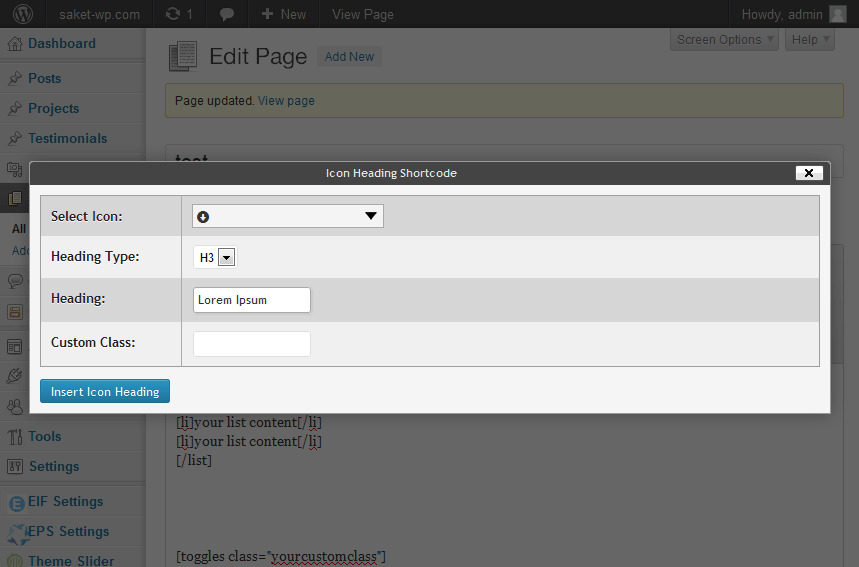
[iconheading type="h2" style="glyphicon-arrow-down" class="test"]
 ...
[/iconheading]
[iconheading] Shortcode Parameters are:
| Parameter |
Description |
Required |
Values |
Default |
| type |
Heading Type for icon heading |
required |
h1, h2, h3, h4, h5, h6 |
h1 |
| style |
Icon for icon heading |
required |
Icons |
|
| class |
Add custom class to icon heading div in front end |
optional |
|
|
10. Panel
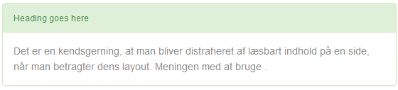
Panel Shortcode is used to show panel in front end. To add Panel to your Page/Post click on Panel Shortcode icon. A dialogue box will appear, select value for style, Check "Show Footer" if you want to include panel footer, provide value for custom class. click on "Insert Panel" button. Shortcode will be added to your editor.
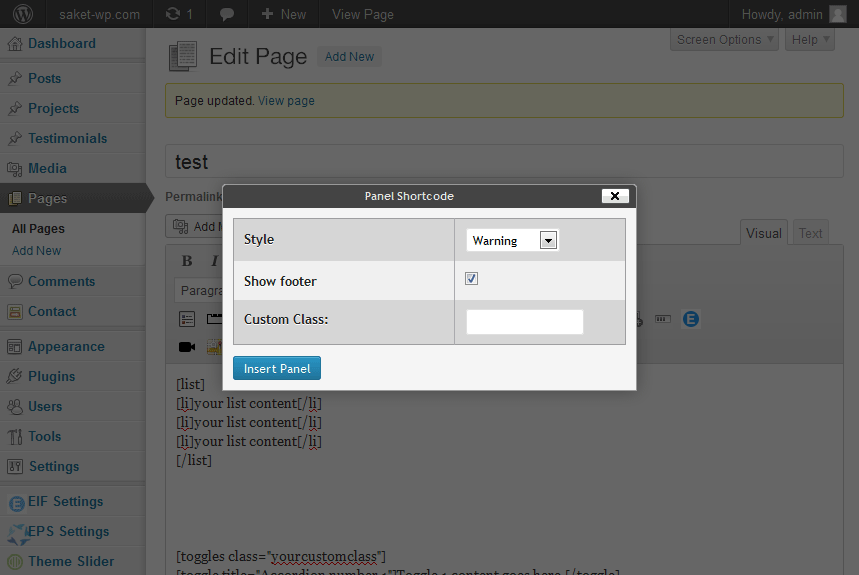
[panel style="panel-success" class="test"]
	[panel-header]
	 ...
	[/panel-header]
	[panel-content]
	 ...
	[/panel-content]
	[panel-footer]
	 ...
	[/panel-footer]
[/panel]
[panel] Parameters are:
| Parameter |
Description |
Required |
Values |
Default |
| style |
Panel style |
required |
panel-default, panel-primary, panel-warning, panel-success, panel-info, panel-danger |
panel-default |
| class |
Add custom class to panel div in front end |
optional |
|
|
[panel-header] Parameters are:
None
[panel-content] Parameters are:
None
[panel-footer] Parameters are:
None
11. Popover
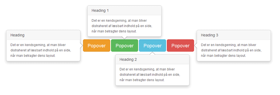
Popover is used to show brief description about a button on its hover or click. To add Popover to your Page/Post click on Panel Shortcode icon. A dialogue box will appear, select value for Popover Style, Trigger Popover On, Button Style and Button type, provide value for Popover Title Text, popover Content and Custom Class. click on "Insert Popover" button. Shortcode will be added to your editor.
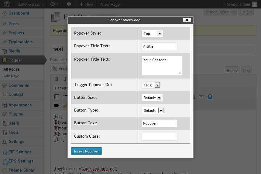
[oscpopover title="A title" pop_content="Your Content" trigger="click" style="top" size="button-lg" type="btn-default" ]
 ...
[/oscpopover]
[popover] Parameters are:
| Parameter |
Description |
Required |
Values |
Default |
| style |
Specifies popover style either left,right, top, bottom |
required |
left, right, top, bottom, auto |
top |
| title |
Popover Title |
optional |
|
A Title |
| pop_content |
Popover content to be shon on button hover or click |
required |
|
Your Content |
| trigger |
Specifies when to show popover content either on button hover or click |
required |
click, hover |
click |
| type |
Specifies button style |
required |
btn-default, btn-primary, btn-primary, btn-success, btn-info, btn-warning, btn-danger, btn-link |
btn-default |
| size |
Specifies button size |
optional |
btn-lg, btn-sm, btn-xs |
btn-lg |
| class |
Add custom class to Popover div in front end |
optional |
|
|
12. Button Dropdown
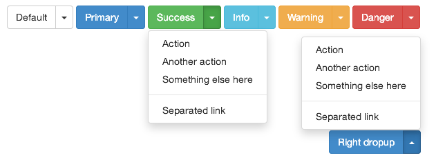
Button Dropdown is bootstrap dropdown which is triggered on button click. To add Button Dropdown to your Page/Post click on Dropdown Shortcode icon. A dialogue box will appear, select value for button style, size, dropup, split and text. Add new dropdown items by clicking on "Add New Item" link. Provide dropdown item type, title link and whether to diisable it or not. Provide custom class and click on "Insert Dropdowm" button. Shortcode will be added to your editor.
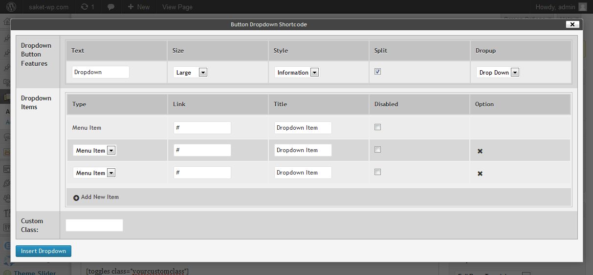
[dropdown dropup="dropup" class="test"]
	[dropdownhead style="btn-primary" size="btn-sm" split="split"]
	 ...
	[/dropdownhead]
	[dropdownbody]
		[dropdownitem type="menuitem" link="#" ] ... [/dropdownitem]
		[dropdownitem type="menuitem" link="#" disabled="disabled"] ... [/dropdownitem],
		[dropdownitem type="menuitem" link="#" ] ... [/dropdownitem]
	[/dropdownbody]
[/dropdown]
[dropdown] Parameters are:
| Parameter |
Description |
Required |
Values |
Default |
| dropup |
This parameter specifies whether to make the alignment of dropdown downward or upward |
required |
dropdown, dropup |
dropdown |
| class |
Add custom class to Dropdown div in front end |
optional |
|
|
[dropdownhead] Parameters are:
| Parameter |
Description |
Required |
Values |
Default |
| style |
Specifies button style |
required |
btn-default, btn-primary, btn-primary, btn-success, btn-info, btn-warning, btn-danger, btn-link |
btn-default |
| size |
Specifies button size |
optional |
btn-lg, btn-sm, btn-xs |
btn-lg |
| split |
Split dropdown trigger from button |
optional |
split |
|
[dropdownbody] Parameters are:
None
[dropdownitem] Parameters are:
| Parameter |
Description |
Required |
Values |
Default |
| type |
Type of dropdownitem |
required |
menuitem, divider |
menuitem |
| link |
Dropdown item link if dropdown item type is link |
optional |
|
# |
| disabled |
Weather to disable the dropdown item link |
optional |
disabled |
|
13. Label
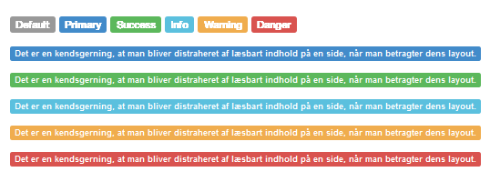
Label Shortcode is used to show bootstrap label in front end. To add Label to your Page/Post click on Label Shortcode icon. A dialogue box will appear, select value for label type, provide value for label content and custom class and click on "Insert Label" button. Shortcode will be added to your editor.
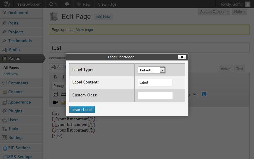
[label type="label-primary" class="test"]
 ...
[/label]
[label] Parameters are:
| Parameter |
Description |
Required |
Values |
Default |
| type |
Specifies the label type. |
required |
label-default, label-success, label-info, label-primary, label-warning, label-danger |
label-default |
| class |
Add custom class to Label span in front end |
optional |
|
|
14. Well

Use the well as a simple effect on an element to give it an inset effect. To add Well to your Page/Post click on Well Shortcode icon. A dialogue box will appear, select value for well type, provide value for well content and custom class and click on "Insert Well" button. Shortcode will be added to your editor.
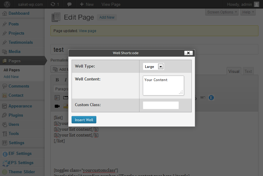
[well type="well-lg" class="test"]
 ...
[/well]
[well] Parameters are:
| Parameter |
Description |
Required |
Values |
Default |
type |
Specifies well type |
optional |
well-lg, well-sm |
|
| class |
Add custom class to Well div in front end |
optional |
|
|
15. Responsive Image

Responsive Image shortcode used to add thumbnail as name describes these images are responsive. To add Responsive Image to your Page/Post click on Responsive Image Shortcode icon. A dialogue box will appear, Upload image, provide value for image link, custom class. check border option if you want image with border and click on "Insert Thumbnail" button. Shortcode will be added to your editor.
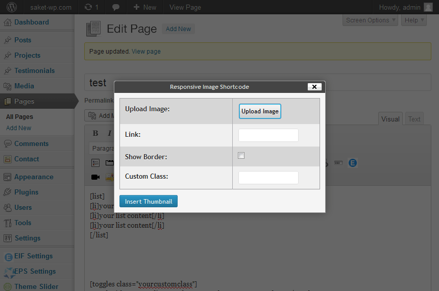
[thumbnail link="https://www.oscitasthemes.in" class="test" border="1" src="https://www.oscitasthemes.in/ebs/wp-content/uploads/2013/10/900images.jpeg"]
[thumbnail] Parameters are:
| Parameter |
Description |
Required |
Values |
Default |
| src |
required |
Source of image on which you want to show |
|
|
| link |
Image link where you want to redirect on image click |
optional |
|
|
| border |
Adds border to image |
optional |
1 |
|
| class |
Add custom class to Well div in front end |
optional |
|
|
16. Icon

Icon shortcode is used to add icon to your content any where you want. To add Icon to your Page/Post click on Icon Shortcode icon. A dialogue box will appear select icon shape, provide value for custom class and click on "Insert Image" button. Shortcode will be added to your editor.
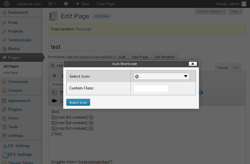
[icon type="glyphicon-check" class="test"]
[icon] Parameters are:
| Parameter |
Description |
Required |
Values |
Default |
| type |
Icon type |
required |
Icons |
glyphicon-adjust |
| class |
Add custom class to icon in front end |
optional |
|
|
17. Image Effect
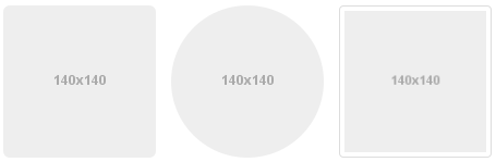
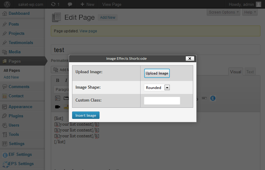
Image shortcode is used to provide effect to image, these images are not responsive. To add Image with effects to your Page/Post click on Image Effect Shortcode icon. A dialogue box will appear, Upload image, select image shape, provide value for custom class and click on "Insert Image" button. Shortcode will be added to your editor.
[image class="test" src="http://localhost/ebs/wp-content/uploads/2013/10/900images.jpeg" shape="img-circle"]
[image] Parameters are:
| Parameter |
Description |
Required |
Values |
Default |
| src |
required |
Source of image on which you want image effects |
|
|
| shape |
image shape, the image will be displayed in your selected shape |
required |
img-rounded, img-circle, img-thumbnail |
img-rounded |
| class |
Add custom class to image in front end |
optional |
|
|
18. Progress Bar
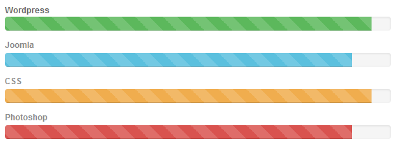
Progress bar shortcode used to provide feedback on the progress of a workflow or action with simple yet flexible bootstrap progress bar. To add Progressbar to your Page/Post click on Progress Bar Shortcode icon. A dialogue box will appear, select Progreebar type, provide value for progress bar label, vale and custom class. Check stripped and animated options if you want stripped and animated progressbar and click on "Insert Progressbar" button. Shortcode will be added to your editor
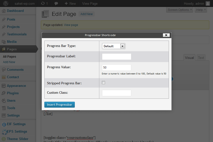
[progressbar value="50" class="test" bartype="progress-bar-info" barstyle="progress-striped active" label="test"]
[progressbar] Parameters are:
| Parameter |
Description |
Required |
Values |
Default |
| value |
A numeric value for progress bar, If you provide 50 the bar will be 50% filled |
required |
0-100 |
50 |
| bartype |
Bar type of progress bar |
optional |
progress-bar-success, progress-bar-info, progress-bar-warning, progress-bar-danger |
|
| barstyle |
this parameter specifies additional striped effect to bar |
optional |
progress-striped |
|
| barstyle |
Animate the stripes right to left. Not available in all versions of IE |
optional |
active |
|
| label |
Title for progressbar |
optional |
|
|
| class |
Add custom class to Progress Bar div in front end |
optional |
|
|
19. Button Group
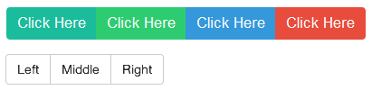
Button Group group of adjoining buttons. To add Button Group to your Page/Post click on Button Group Shortcode icon. A dialogue box will appear, select button group style and size of button group buttons. Add new button group buttons by clicking on "Add New Item" link. Provide button specification for each button. Provide custom class and click on "Insert Button Group" button. Shortcode will be added to your editor.
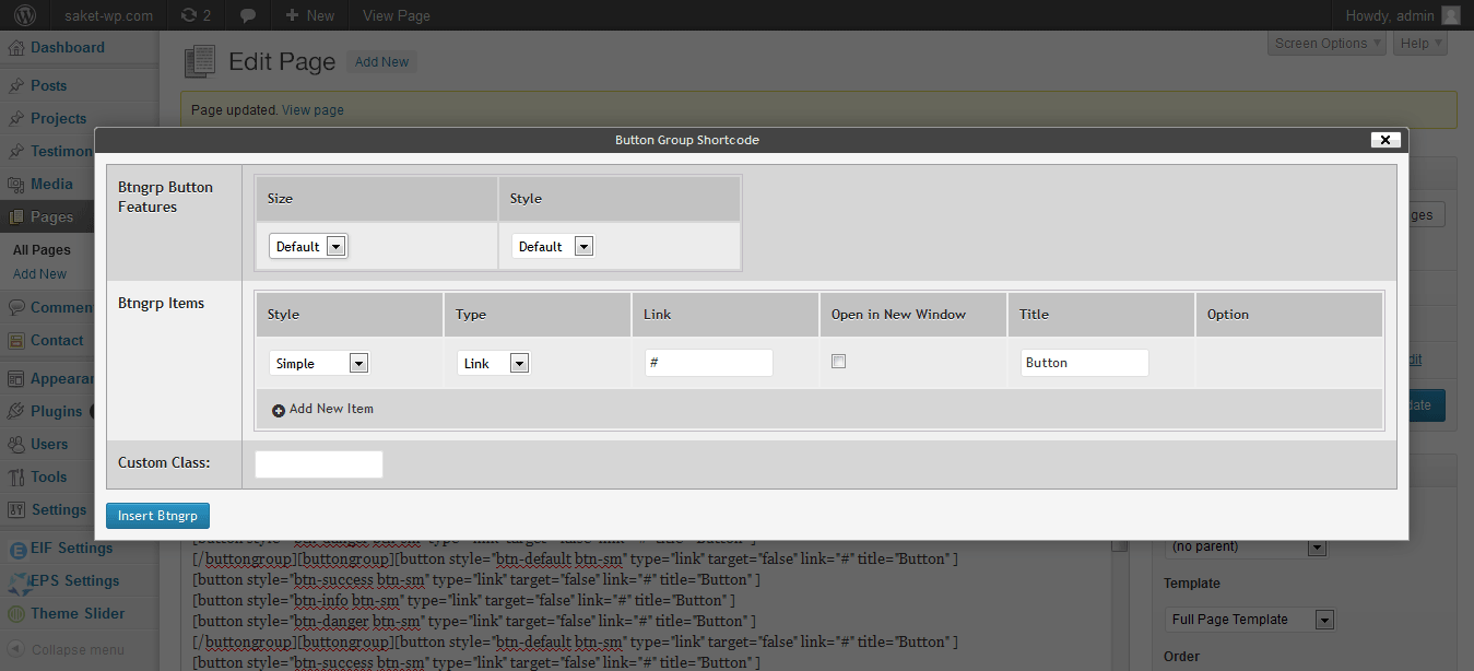
[buttongroup class="test" style="justified"]
    [button style="btn-success btn-sm" type="button" title="Button1" ]
    [button style="btn-info btn-sm" type="link" target="true" link="http://google.com" title="Button2" ]
    [button style="btn-primary btn-sm" type="link" target="false" link="#" title="Button3" ]
[/buttongroup]
[buttongroup] Parameters are:
| Parameter |
Description |
Required |
Values |
Default |
| style |
Style of button group |
optional |
vertical, justified |
|
| class |
Add custom class to Button Group div in front end |
optional |
|
|
[button] Parameters are:
20. Button Group Toolbar

Button Group Toolbar Combine sets of Button groups and seems like button group menu. To add Button Group Toolbar to your Page/Post click on Button Group Toolbar Shortcode icon. Shortcode will be added to your editor, replace the custom class and insert button groups as content by using button group shortcode.
[btngrptoolbar class="yourcustomclass"]
    [buttongroup class="test" style="justified"]
        [button style="btn-success btn-sm" type="button" title="Button1" ]
        [button style="btn-info btn-sm" type="link" target="true" link="http://google.com" title="Button2" ]
    [/buttongroup]
    [buttongroup class="test" style="justified"]
        [button style="btn-success btn-sm" type="button" title="Button1" ]
        [button style="btn-info btn-sm" type="link" target="true" link="http://google.com" title="Button2" ]
        [button style="btn-primary btn-sm" type="link" target="false" link="#" title="Button3" ]
    [/buttongroup]
    [buttongroup class="test" style="justified"]
        [button style="btn-success btn-sm" type="button" title="Button1" ]
    [/buttongroup]
[/btngrptoolbar]
[btngrptoolbar] Parameters are:
| Parameter |
Description |
Required |
Values |
Default |
| class |
Add custom class to button group toolbar div in front end |
optional |
|
yourcustomclass |
21. Description List

List show responsive description list items in front end.To add Description Lists to your Page/Post click on Description List Shortcode icon. A dialogue box will appear, select list style, provide value for No. of list item and custom class, click on "Insert List" button. Shortcode will be added to your editor.
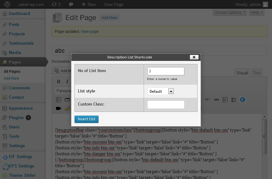
[dl class="test" style="dl-horizontal"]
    [dlitem heading="Heading 1"]...[/dlitem]
    [dlitem heading="Heading 2"]...[/dlitem]
    [dlitem heading="Heading 3"]...[/dlitem]
[/dl]
[dl] Parameters are:
| Parameter |
Description |
Required |
Values |
Default |
| style |
Specifies style of description list either vertical or horizontal. |
optional |
dl-horizontal |
|
| class |
Add custom class to description list div in front end |
optional |
|
|
[dlitem] Parameters are:
| Parameter |
Description |
Required |
Values |
Default |
| heading |
Heading of description list item |
required |
|
Heading 1 |
22. Service Box
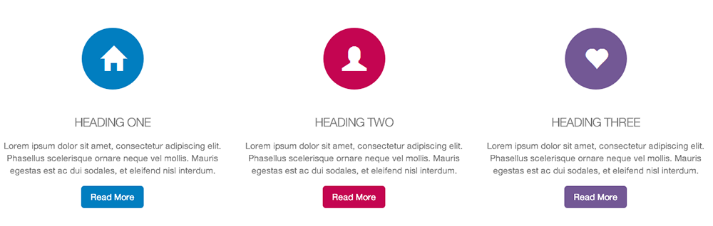
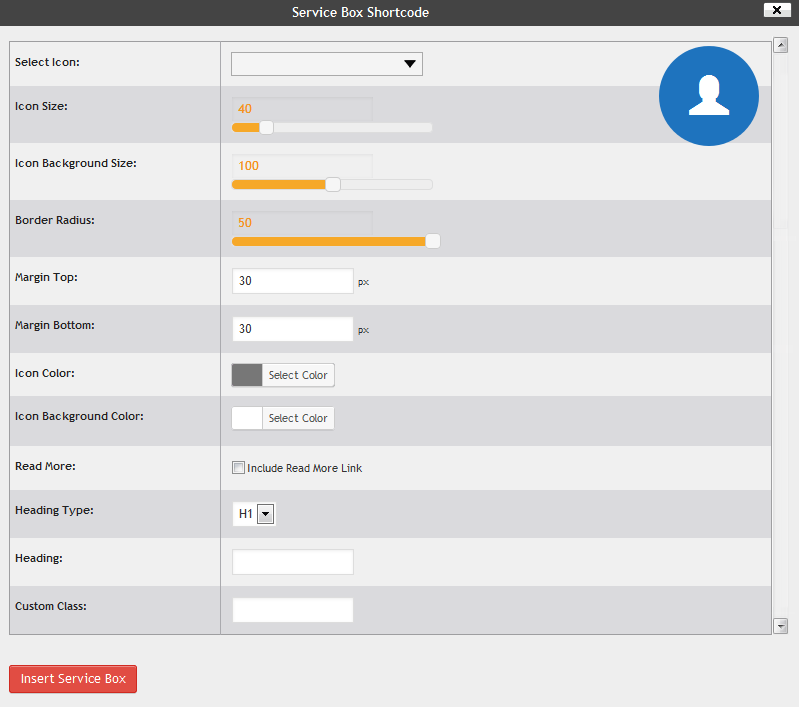
[servicebox icon="glyphicon-user" icon_size="40" iconbg_size="100" iconbg_radius="50"
 margin_bottom="30" margin_top="30" iconbgcolor="#FFFFFF" iconcolor="#777777" headingtype="h1"
heading="Heading Goes Here"  readmore="true" readmore_link="#" readmore_text="Read More" readmorestyle="default"]
Your Content
[/servicebox]
4. Easy Bootstrap Shortcode(EBS) Settings
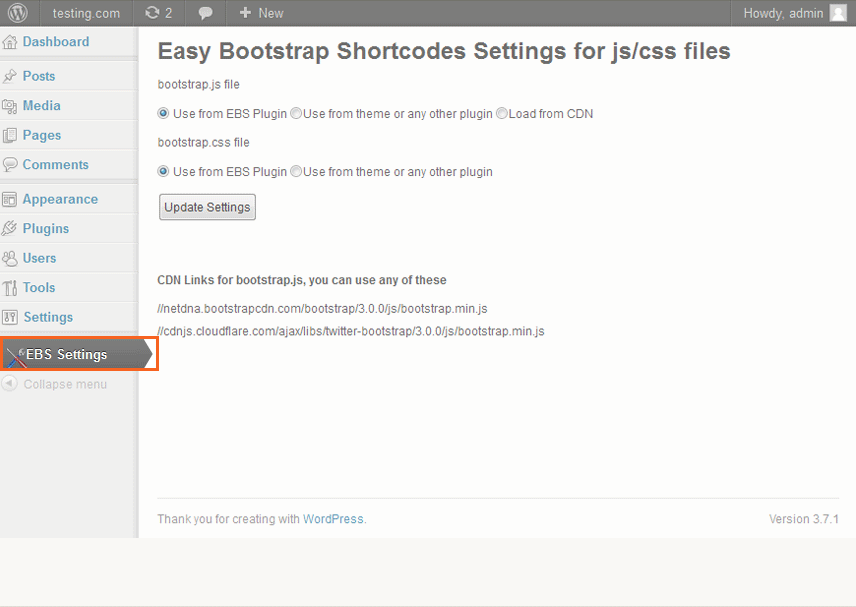
Easy Bootstrap Shortcode Settings page is provide to make plugin more flexible and compatible with bootstrap theme.
Here you can customize the inclusion of bootstrap JS and CSS files to your site
- Bootstrap JS: You can include JS files from plugin, theme/other plugin or CDN
- Bootstrap CSS: You can include CSS files from plugin or theme/other plugin
5. Credits
- Twitter Bootstrap (http://getbootstrap.com/)